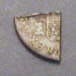
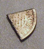
cut coin-reale?

scratcher

Sr. Member
Jan 31, 2008
463
45

Attachments

  • cutcoin 012.JPG
    cutcoin 012.JPG
    26.8 KB · Views: 292
  • cutcoin2 006.JPG
    cutcoin2 006.JPG
    55.6 KB · Views: 319
I'm pretty sure quartering coins was the way of making change at one time when not many coins were available. This is a good example. Monty
 

Upvote 0
Thanks for the reply intimer. We agree that the reverse matches pretty well, but it doesn't seem to match on the front? It doesn't appear that the design cuts inward near the 'I' in gratia. What do you think? We aren't really sure that it is a 2 on the back either but could be.
 

Upvote 0
yeah, i noticed the difference after hurredly sending my reply. i may try to locate an old guy that knows his stuff on this sort of thing. i will try to get back.
mike
 

Upvote 0
Nice "piece of eight". Actually it looks like a piece of 2 Reale. I think intimers correct on the Carolus III. It does look kinda funky but I think its a 1781. Look closely you will see part of the 8. Definitely Mexico Mint. I also see the chin and neck but after that it gets skewed. I think it has a waffle type impression on it. You may try posting in the Spanish Cobs forum here.
Spanish Carolus III piece.jpgspanish piece of eight.jpg
 

Upvote 0
Thanks BC,

That was what we thought it was at first also. Please explain the 'waffle impression'. Is it some kind of error? Thanks for the help.
 

Upvote 0
scratcher said:
Thanks BC,

That was what we thought it was at first also. Please explain the 'waffle impression'. Is it some kind of error? Thanks for the help.
I dont know... just an observation.It appears to have a waffle like impression. I dont know what would cause that. Does it look damaged? Maybe from pliers? Just a guess. Try the cobs forum here.
 

Upvote 0
I too was thinking it could have happened when they were cutting it, but it really doesn't look that way under magnification and there is nothing apparent on the other side. It just looks like part of the original design. It certainly appears under magnification that the low spots of the design are the same height as the rest of the background surface and the higher spots rise above the background. Will try cob section eventually. I'm pretty sure we already know what it is, just why does it look so different?

Thanks
 

Upvote 0

Top Member Reactions

Users who are viewing this thread

Back
Top