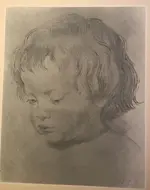
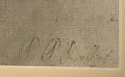
Surely you don't think this is a contemporary work and actually by Rubens?
The original is an extremely subtle work in pen and ink with with highlights and shadows in three colours of chalk. Not only has all of that artistic subtlety been lost in your print, but so too has the symbolism of the necklace. In the original, it's shaded with sanguine chalk to emphasise that it's coral (which was believed in those times to protect the wearer from evil and illness).
This is some quality content. I think we need a banner sticky for quality responses
chub
It is more likely a museum tourist purchased gift store print. But the signature doesn't look close enough to the artists handwriying. The p shaped are yo curvslinear and the end of his whole name does trail downwards