grossmusic
Sr. Member
- Joined
- Jul 19, 2013
- Messages
- 348
- Reaction score
- 445
- Golden Thread
- 0
- Location
- Cape Canaveral
- Detector(s) used
- I detect the history: I've visited archives up & down the entire US East Coast, Bahamas, Jamaica, Kew, The Hague, etc. Have yet to go to Seville or S.American archives.
- Primary Interest:
- Shipwrecks
- #1
Thread Owner
HELP!
The novel is in process, but I'm having launch delays just like Echeverz & Ubilla faced in Havana!
Official launch date is 300 years after the disaster: July 31, 2015, but the first printing will be complete by the ships' launching on July 24, & with the book in hand, I'll be at the book signing at IRC on July 27th.
I need your help with a couple things:
1) "Like" my opening line so I can get some feedback from James Patterson:
https://www.facebook.com/grossmusic/posts/10153382493946970?fref=nf
&/or
"Retweet" at https://twitter.com/GrossWriting/status/619256503179079681
2) Vote (here in the forum) for your favorite cover:
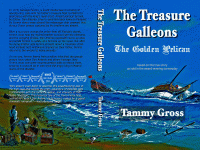
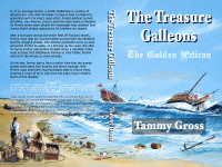
Ralph Curnow is allowing me to use his excellent painting "The Day After" as my cover. I've created two versions...
DARK:

or
LIGHT:

3) Pre-Order the e-book here:
Amazon.com: The Treasure Galleons: The Golden Pelican eBook: Tammy Gross, Ralph Curnow: Kindle Store
Anyone who pre-orders will receive $5 off the PRINT book!
4) The book will have original artwork inside as well!
If anyone has 1715-related original artwork or a great map of the 1715 treasure galleons routes to contribute, let me know: tammy@thetreasuregalleons.com
Thanks all! The more pre-sales, tweets, likes, etc., the more likely that the screenplay the book is based on will get produced.
The novel is in process, but I'm having launch delays just like Echeverz & Ubilla faced in Havana!
Official launch date is 300 years after the disaster: July 31, 2015, but the first printing will be complete by the ships' launching on July 24, & with the book in hand, I'll be at the book signing at IRC on July 27th.
I need your help with a couple things:
1) "Like" my opening line so I can get some feedback from James Patterson:
https://www.facebook.com/grossmusic/posts/10153382493946970?fref=nf
&/or
"Retweet" at https://twitter.com/GrossWriting/status/619256503179079681
2) Vote (here in the forum) for your favorite cover:
Ralph Curnow is allowing me to use his excellent painting "The Day After" as my cover. I've created two versions...
DARK:

or
LIGHT:

3) Pre-Order the e-book here:
Amazon.com: The Treasure Galleons: The Golden Pelican eBook: Tammy Gross, Ralph Curnow: Kindle Store
Anyone who pre-orders will receive $5 off the PRINT book!
4) The book will have original artwork inside as well!
If anyone has 1715-related original artwork or a great map of the 1715 treasure galleons routes to contribute, let me know: tammy@thetreasuregalleons.com
Thanks all! The more pre-sales, tweets, likes, etc., the more likely that the screenplay the book is based on will get produced.
Last edited:


